

DESIGNING MTS FOR OUR YOUNGEST USERS
The NGL K–12 Design Team is now providing a new and exciting, research-based user experience to our K–2 MindTap School students to better enable their engagement with exceptional content and focus on the joy of learning.
THE CHALLENGE
MindTap School was originally built without the K–2 user in mind.
The MindTap user experience was designed for Higher-Ed students.
NGL Sales, Marketing, and Product teams learned from customers that the MTS interface was not intuitive for K–2 users.
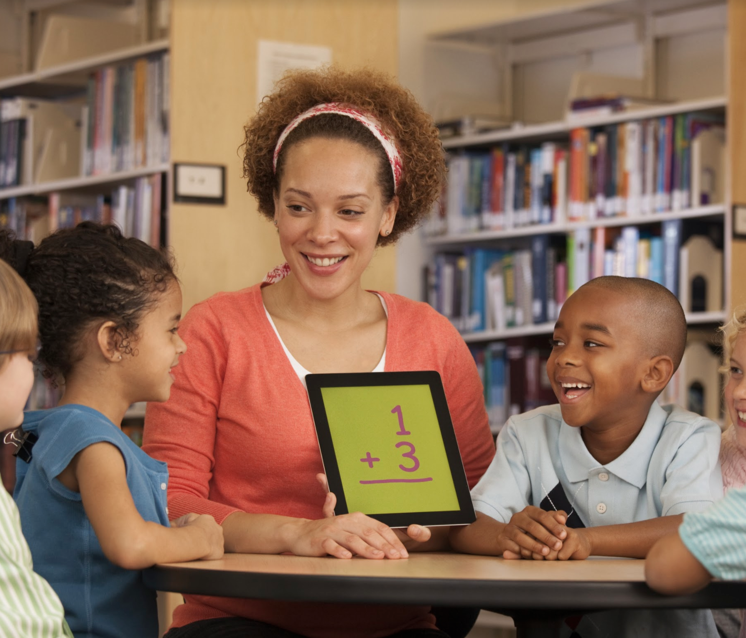
K–2 students have unique cognitive abilities, comprehension skills, and ergonomic needs compared to older learners.
THE GOALS
Understand the unique learning needs of K–2 students
Students are just learning to read.
Attention span is short for children at this age.
Lesson structures are teacher-guided, not self-guided.
Young students' physical coordination is different than that of older students, so device UI ergonomics must be considered.
Age-appropriate UX and UI
Screen content needs to be unambiguous. When a teacher describes an element on-page, a student should be able to identify that unique element quickly.
Visuals should be as literal as possible. For example, when referencing a concept like 'library', the icon should contain library books. When referencing non-literal concepts, the visual should be familiar (e.g., using a ‘star’ icon for saved/favorites).
Call-to-action buttons must be accessibility-compliant for users of this age (i.e., have large touch-targets to account for imprecise tap/touch/mouse-click interactions).
Students must be able to navigate the interface using visuals as well as words.
Allow the content to shine
Content has to be the focus. Every pixel must have a purpose in that it supports the learning and teaching of materials.
A poor user experience is a disservice to quality content.
RESEARCH & EXPLORATION
We researched the current digital landscape.
Examined competitor platforms and products, including HMH, McGH, and Pearson
Researched consumer Ed-tech competitors, including BrainPop, Leapfrog, FunBrain, Discovery, NASA, NatGeo Kids, among others
We evaluated then began to create.
Played, explored, and mocked-up several concepts
Evaluated and measured every concept against our goals
Refined and iterated the strongest concepts
Created interactive prototypes of the best concepts
USER TESTING
We collected feedback from teachers and students.
We tested two prototypes with users:
Are the interfaces clear, intuitive, and predictable?
Is the meaning, tone, and voice of language understandable?
Are the interfaces engaging and delightful?
Is the purpose of every screen understandable?
Did K–2 students believe the UI designs were made for them?
Generally, which of the two UI prototypes was preferred?
REFINEMENT

We distilled feedback and built a single, more successful design.
Revised and refined the micro-copy
Optimized the navigation
Revised and refined art, typography, iconography, and color palette
We collaborated with the MTS technology team to ensure feasibility.
Closely collaborated throughout the entire project to make certain the design was technically feasible to build
Continuously collaborated throughout the development cycle, including refinement, QA, and launch
Implemented agile-based design project management in JIRA
We created a systematic approach to UI Design.
Created a K–2 UI theme for Magma
Designed universal K–2 UI elements to reduce inconsistencies and save time and cost
Established a K–2 UI Design Library
Implemented Abstract, a version control software, to manage Design Library, track changes, and ensure consistency across usage
FINAL DESIGNS

Home
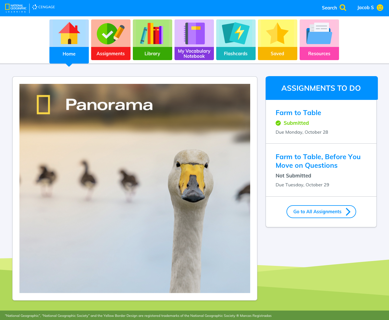
Reader
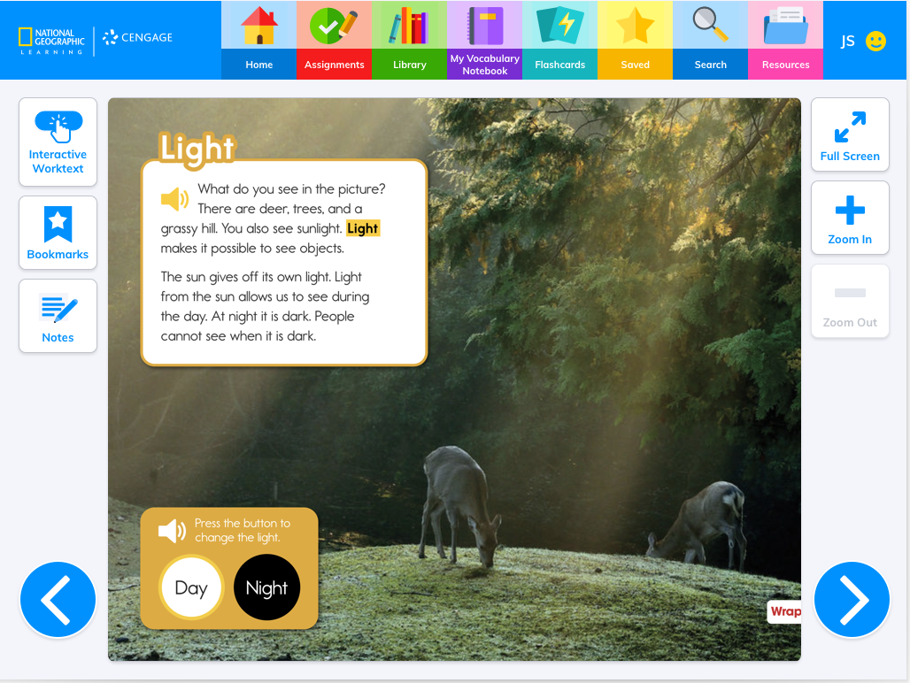
Assignments

Library

My Vocabulary Notebook

Flashcards

Saved

Search

THE TEAM
We are committed to purpose, accountability and, foremost, to our users.
Emily Anderson, Manager, UX Research & Strategy
Scott Baker, Managing Art Director
Theresa Charleston, Senior UX & UI Designer. Copywriting
Michael Farmer, Creative Director
Dan Maron, UX & UI Designer
Michael Rosenquest, UX & UI Designer
Alex von Dallwitz, Art Director